


Hi, I'm Mo Swainston,
a UI and UX designer based
in Cape Town.
I write and design so your products stand out.
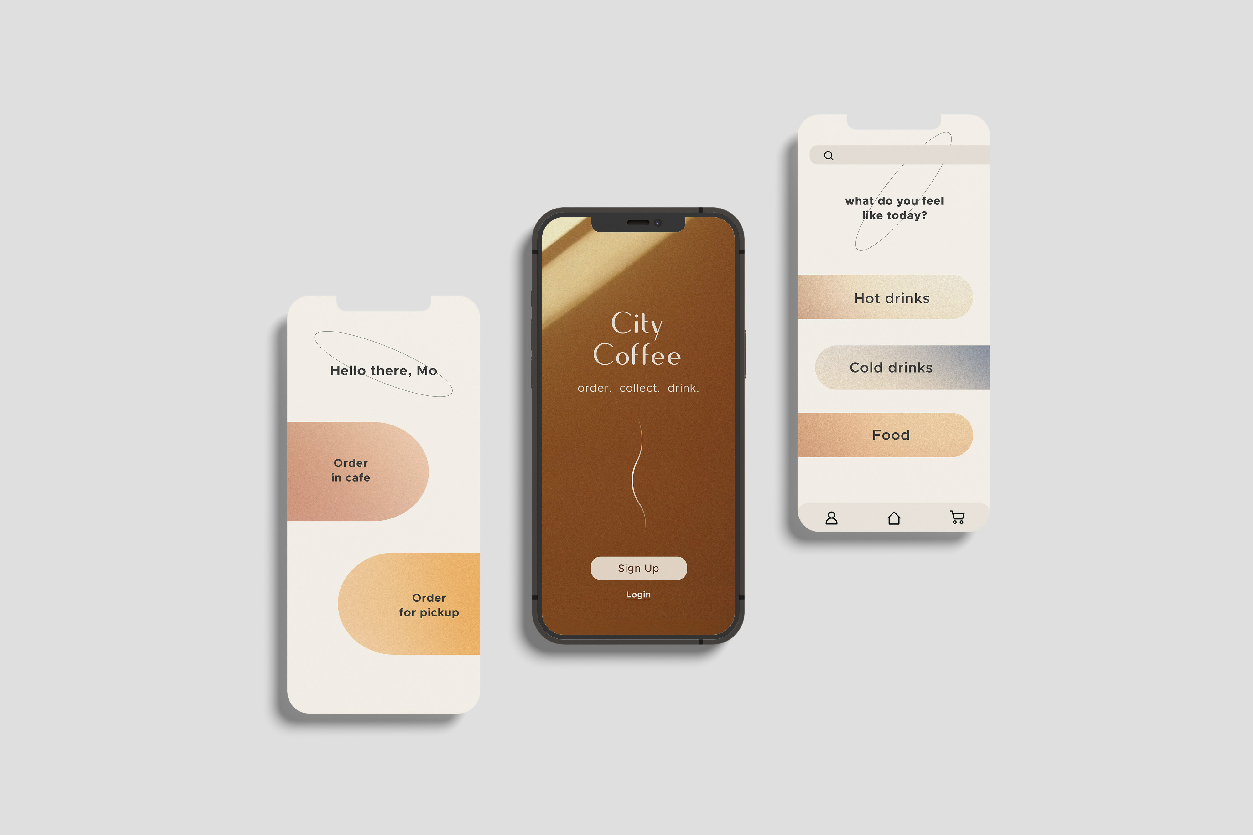
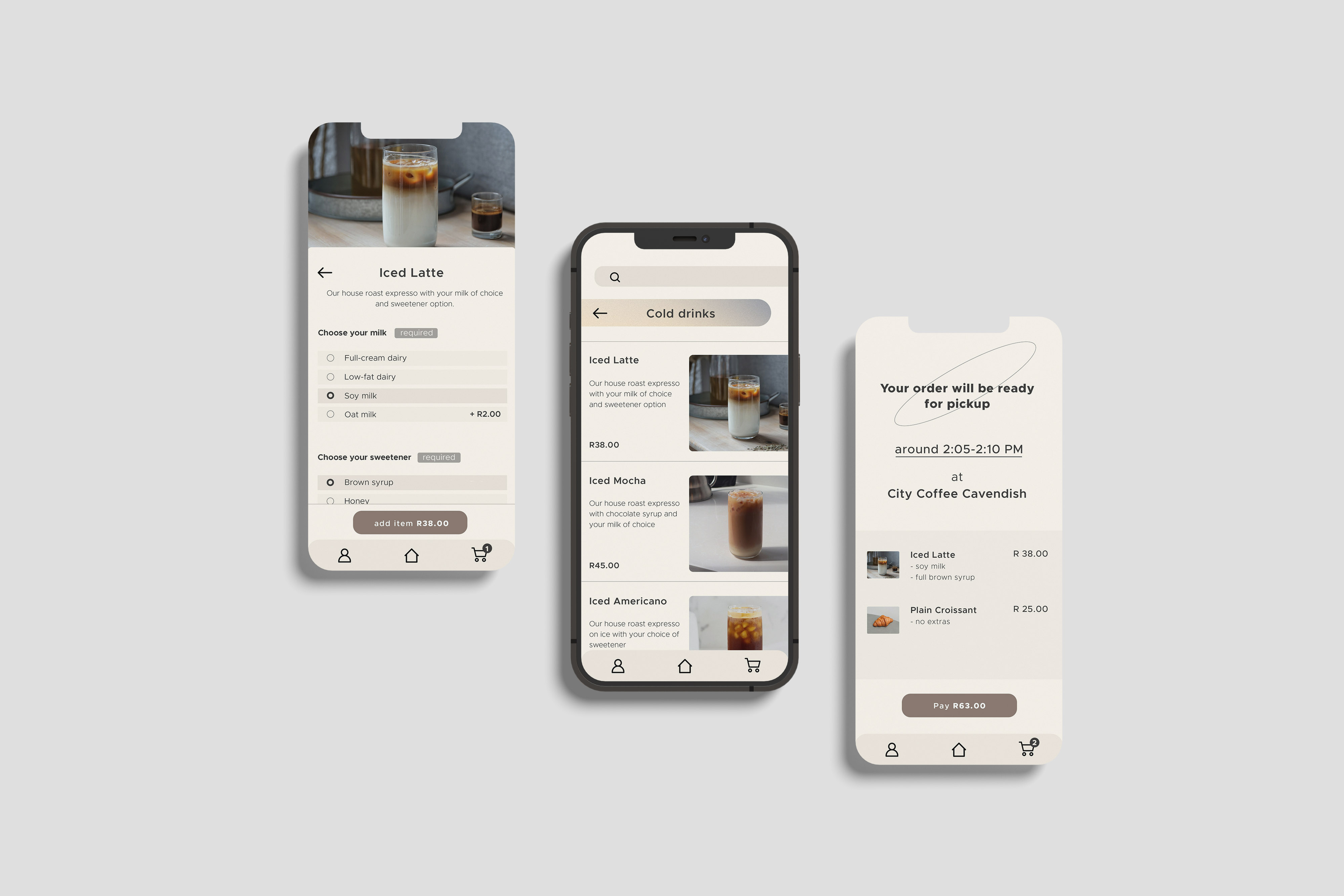
City Coffee
app
User Research
Product design
The goal was to design a user interface that solved the user need of order collection and table deliveries while making the ordering experience more enjoyable overall. I wanted the users to feel inspired every time they opened the app, and to encourage them to order from this cafe just to interact with the app. The ordering interface needed to allow the level of customisability users would expect from an in-person ordering experience, and deliver a strong brand identity.
The interface design needed to inspire users to use it with a strong brand identity for the cafe, but also be simple enough to be used by multiple levels of users without feeling cluttered and convoluted. The interface should also allow the level of customisability users would expect from an in-person order.
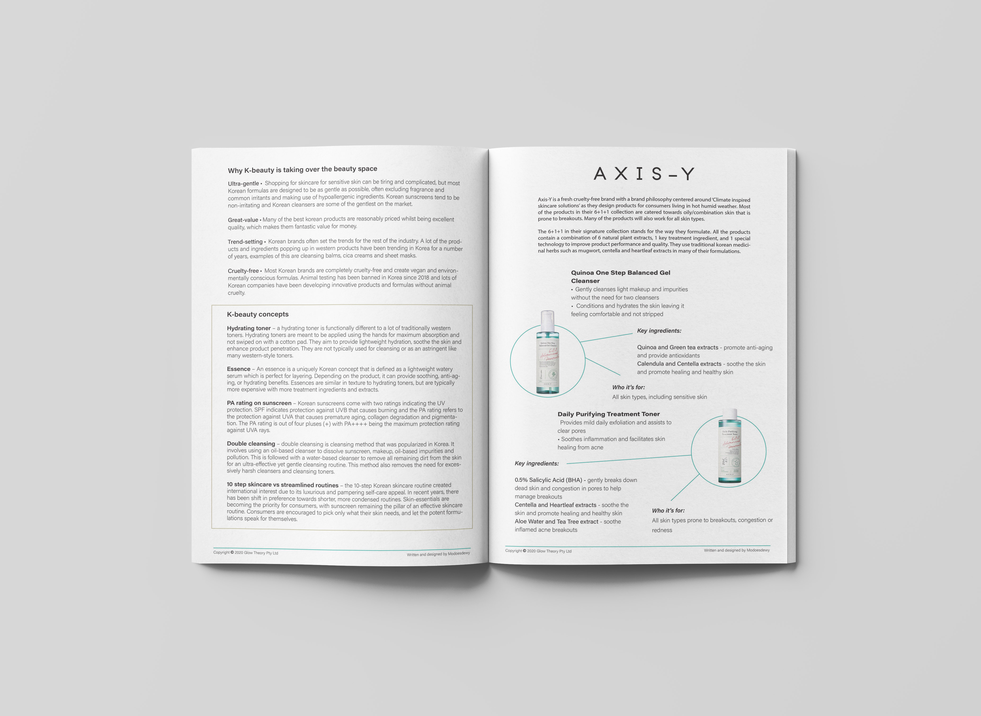
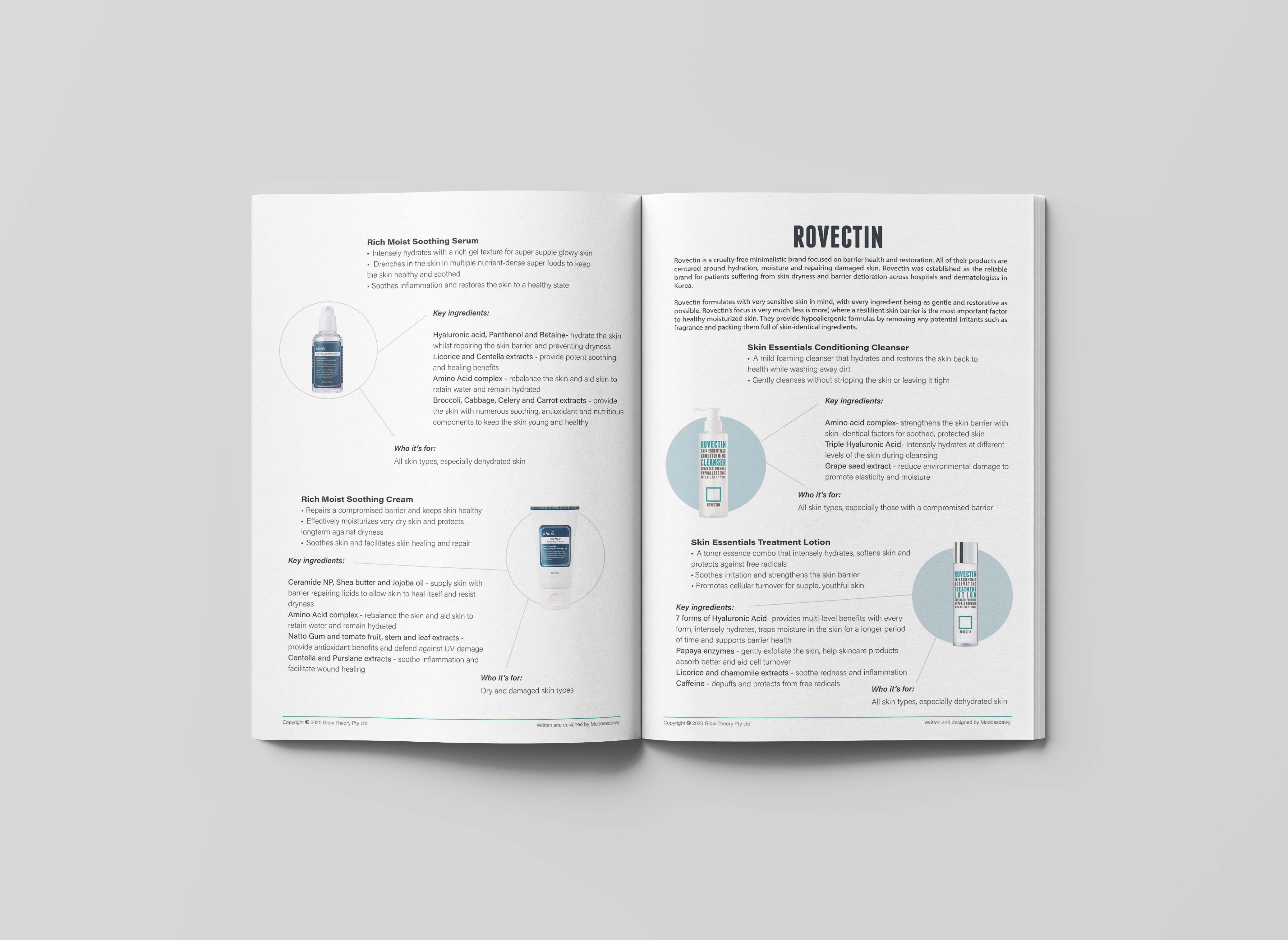
Glow Theory manual
- Product copy
- Content strategy
- Layout design
A project I'm particularly passionate about. I had the pleasure to write and design a product manual for the purpose of training staff for a new retail enterprise. The manual had to function as a product catalogue but also educate the user on the product formulations and help them identify key differences between the different k-beauty brands. Readability was key as the user had to digest a large amount of information. Formulations were broken down to answer the question of what, how, and who for an optimized learning experience.
The goal: to create a usable and valuable training manual of their k-beauty catalogue for training retail staff of a new retail enterprise. The users of the manual needed to be able to identify key sellable and marketable benefits while understanding the formulation aspects. Being able to differentiate between the brands was important in order to target varying market segments.
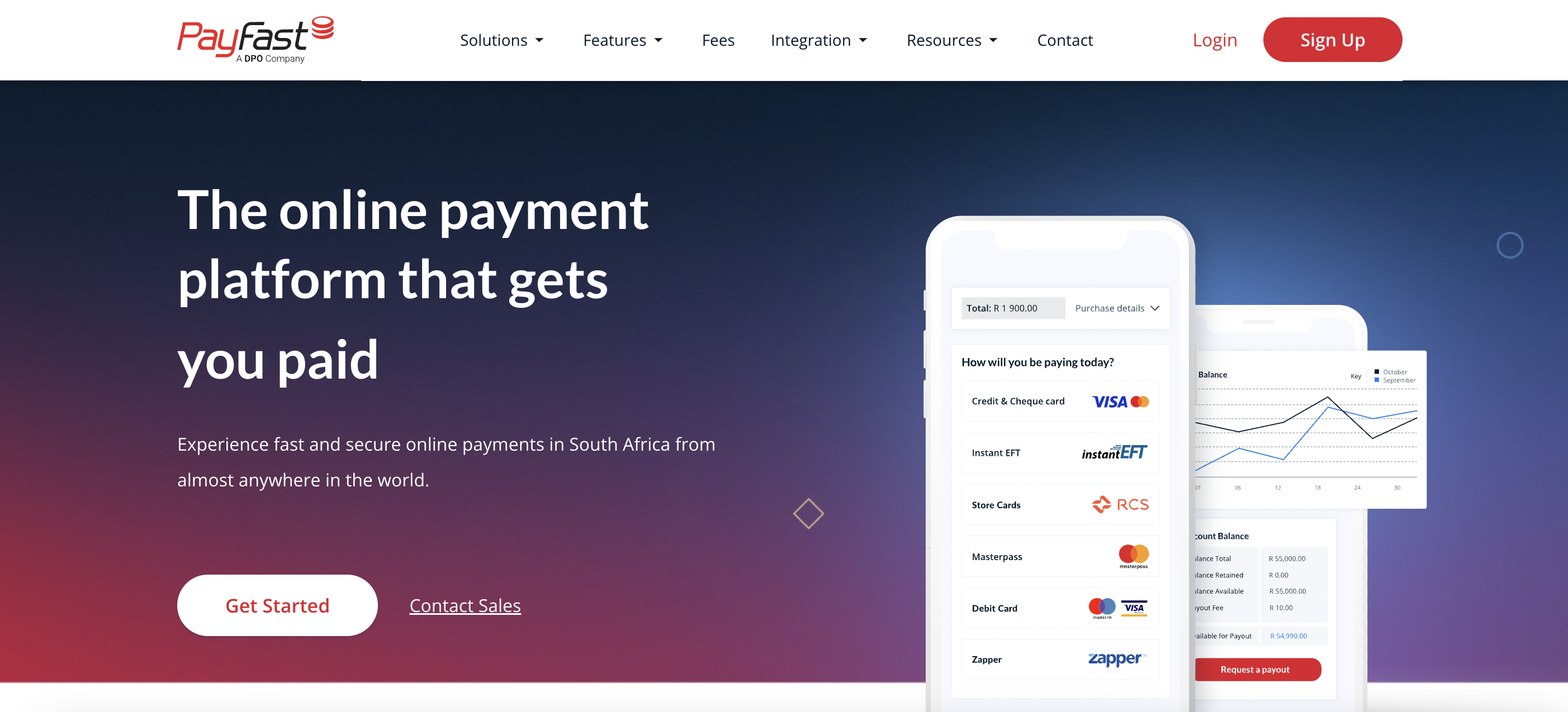
PayFast Website redesign
- Product copy
- Initial wireframing
I led the UX content strategy and initial wireframe for the major website redesign. This was a wonderful opportunity to reframe products and incorporate new products in the website journey.
I worked on the
Luci Wear
blah
R.Y. Originals is a brand of vitamin-, mineral-, and herb-infused edible cannabis capsules that bring you the best of both worlds: a high standards and some amazing supplements.

How much are logo designs?
When will my website go live?
Will I be able to upgrade down the road?
What's the difference between the Pro plans?
Can I cancel my membership at anytime?

Why me?
I'm a user first and a designer second.
I want your users to trust you, and I've learnt that meaningful design builds that trust quickly.
I've had the pleasure of writing and creating content for local and international cosmetic markets and this has given me hands-on experience on how to make copy matter.
The way you speak to your audience affects how they feel, a lot, and how they feel determines if they use your product.
They want to experience your product, visualise it, understand it and that's where I come in.
builds trust and confidence. I'm a strong visual communicator who believes in balance, simplicity and creating a better experience with visual delight.When I'm not drinking coffee, I'm likely propagating new plants, listening to the latest k-RnB album or looking for my next favourite font.
- Figma
+++Design Lead - Adobe Photoshop +++
UX Designer - Adobe Illustrator ++Senior Product Designer
- Adobe XDDesign Lead
- UX writing
- Product and journey design
- App Interface Design
- Web Interface Design
- Skincare and cosmetics
- English writing
- Featured on Behance
What my clients say
Throughout the entire experience working together as a team, Noah is always communicated with me so that I never questioned where we were in the process or what the next steps were. In addition to thinking through an ideal user experience and developing great designs, Noah was a thought partner that helped me think through complex scenarios.

To succeed, every digital product has to be aesthetically appealing, functional, robust, distinctive and memorable. To ensure that the right balance of thesecomponents is maintained, I always stay in close contact with the client.